
BLACK
FRIDAY
Dark mode vs. light mode
A bright screen in a room where the lights are turned down. We can feel the pain in your eyes. Dark interfaces are a solution to this problem. A lot of people accepted this solution gratefully. Another popular reason for switching between the dark and light modes is just for aesthetic reasons. but still, what is the best mode for data visualization? Let's take a look.
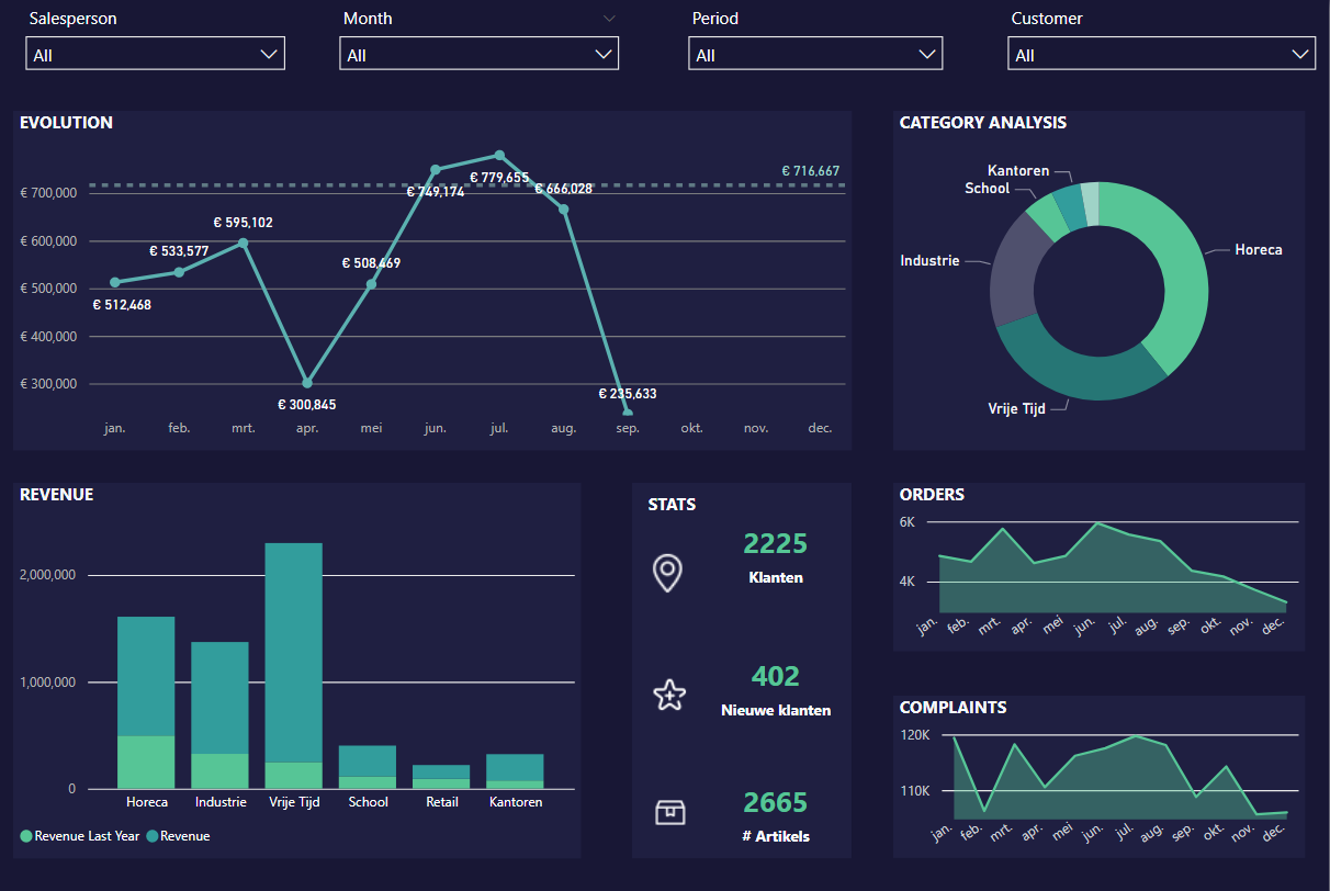
Dark mode advantages

Better visual ergonomics
Eliminates visual distractions
Comfortable and effective
Energy saving
Improved accessibility for light sensitive individuals
Better visual ergonomics
When you feel good in your workplace, in this situation looking at your screen, you will be more productive. Simple as that. You don't mind looking a bit longer at things you like, don't you?
Eliminates visual distractions
A dark mode keeps it classy and neat. No chance for distractions. It will keep focus on the main subject rather than the aesthetics. Also colourful images and graphics will pop out and be more remarkable for the viewer.
Comfortable and effective
When data is shown clear and orderly, the decision process will be easier. It's simply more understandable for your brain. The easier and faster decisions are made, the more productive you are. Time is money.
Energy saving
First of all, we should consider saving energy as much as possible. But additionally, especially when you have an older device, this is an important thing to consider. Dark mode is just a bit more battery-friendly. Always handy when you don't have a charger in sight.
Improved accessibility
The white screen can cause some discomfort for people who are light sensitive. Dark more is more gentle for your eyes and therefore it reduce eye fatigue.
LIGHT MODE ADVANTAGES
Improves reading comprehension
Improves accessibility
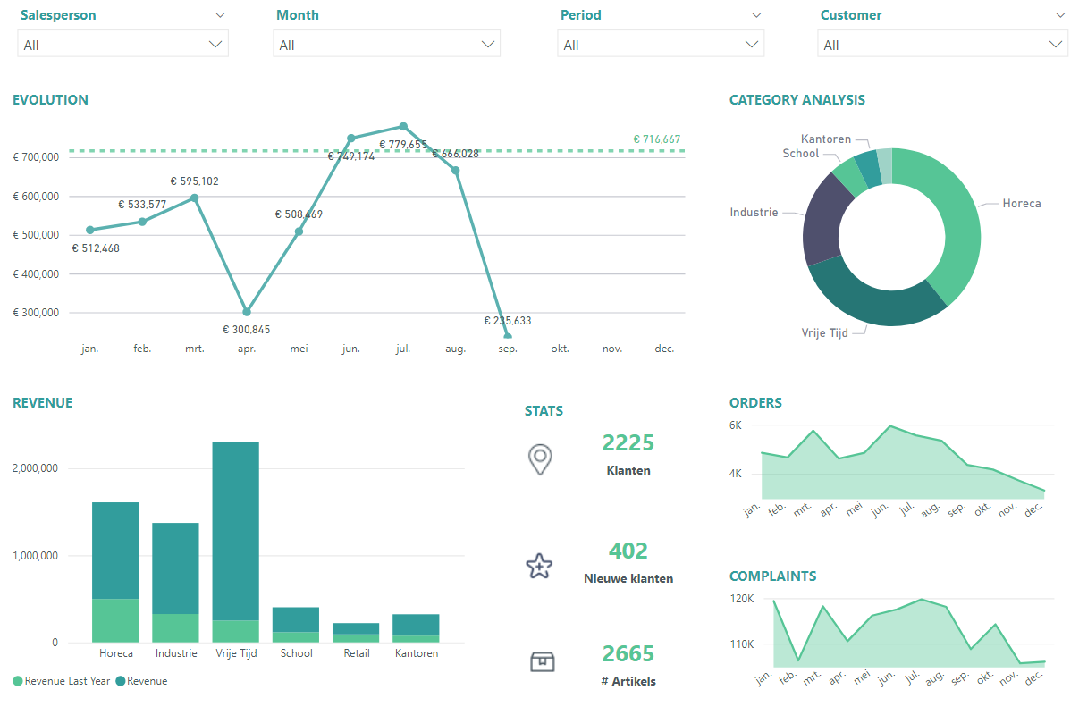
Improves reading comprehension
When reading a lot of text, a light screen will improve reading comprehension. You will also read faster. This in it's turn will save time (and money). Nothing more hateful than reading a little bit of text three times and still not understanding what you just read.
Better visual ergonomics
Light more is more accessible for many people. A lot of people don't know the dark mode option yet, so it will simple look weird to them. They like to stick with the usual and will therefore be faithful to light mode.

Conclusion
At the end of the day, it's not so black and white. Both modes have their own advantages and opinions. Dark modes can be better if you spend a few hours a day behind your screen sifting through data and dashboards. Your eyes will thank you at the end of the day. If you have to read a lot however, a white background will be easier to read, it will be faster and you will understand is more easily.
And to keep in mind: visualization experts will test the conditions and ask themselves some design questions such as:
Will this visualization be printed?
What story am I trying to tell?
Will it be displayed on full screen mode?
etc ...
The design mode will be adjusted to the needs of the user. Both modes have their own advantage, but everyone needs to find what best suits their needs.

Don't be shy,
come and say hi!